Dashboards with Jupyter
and Quarto
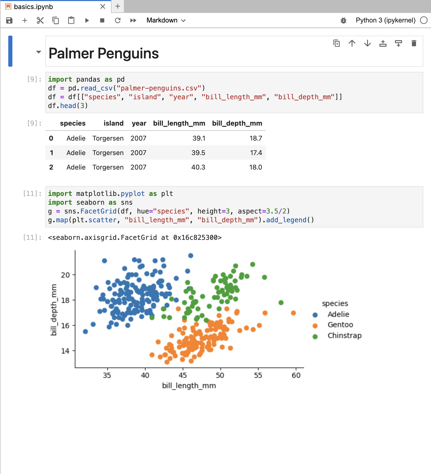
![]() Quarto Basics
Quarto Basics
Quarto — https://quarto.org
An open-source scientific and technical publishing system that builds on standard markdown with features essential for scientific communication.
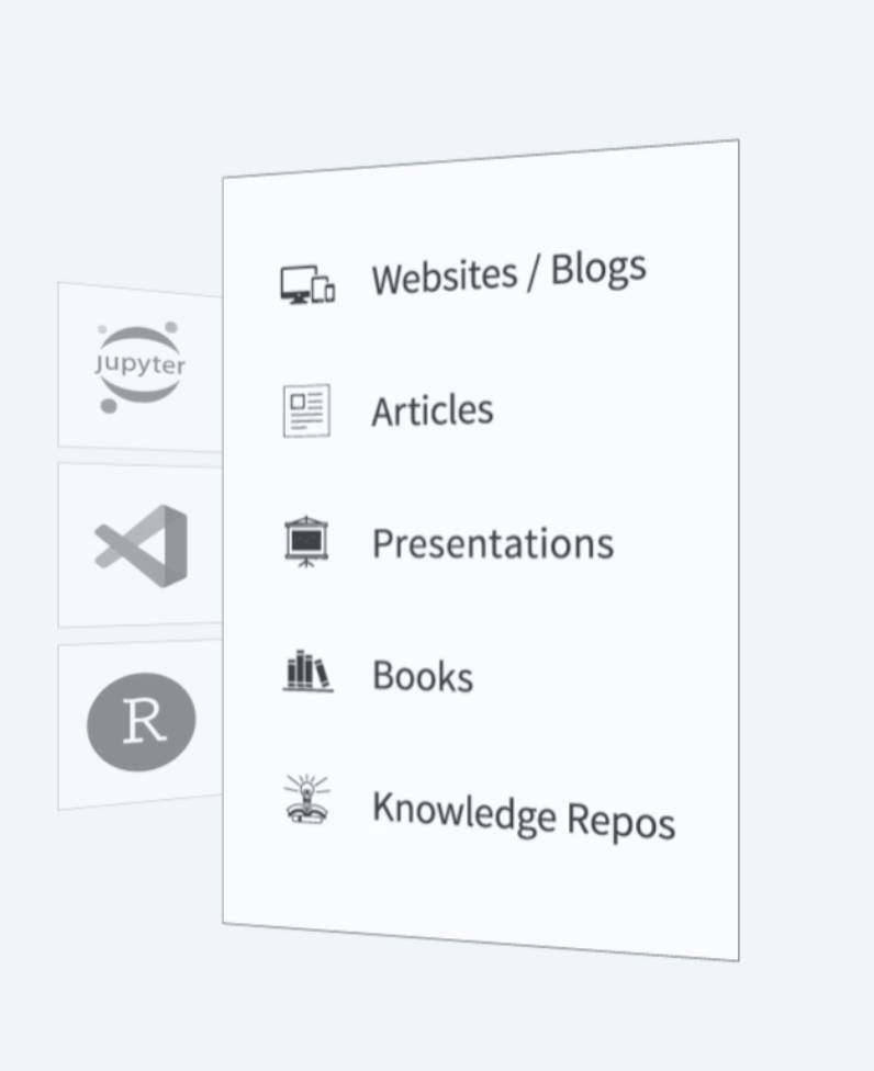
Pandoc Markdown
Jupyter Kernels
Dozens of Output Formats
Specialized Project Types
How does Quarto work?
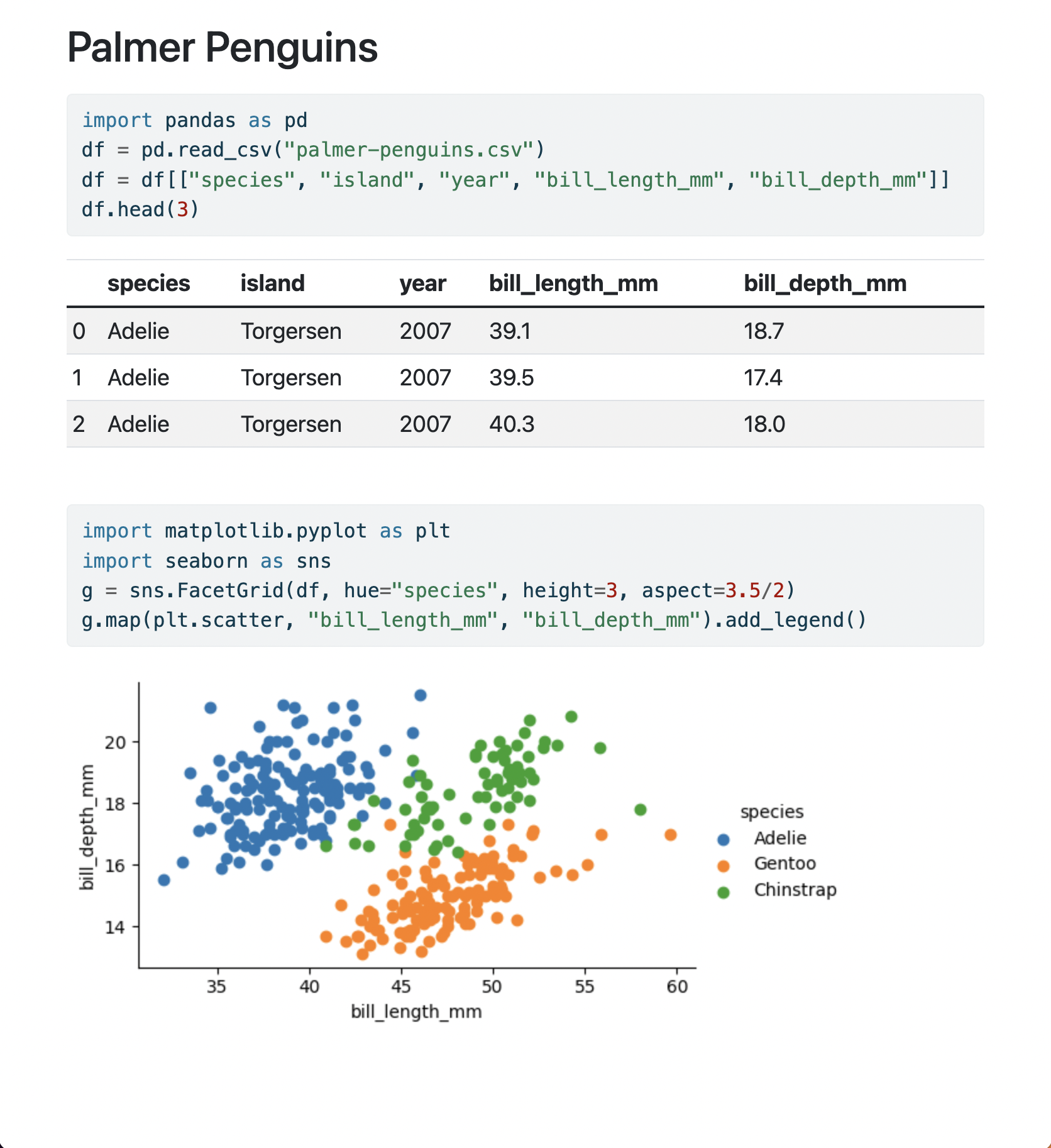
Render Notebook to HTML (default options)
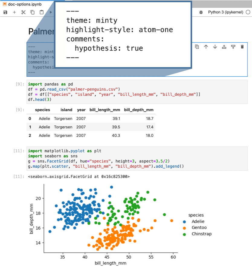
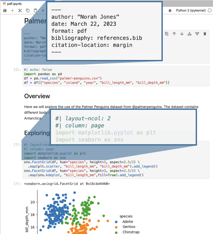
Render Notebook to HTML (document level options)
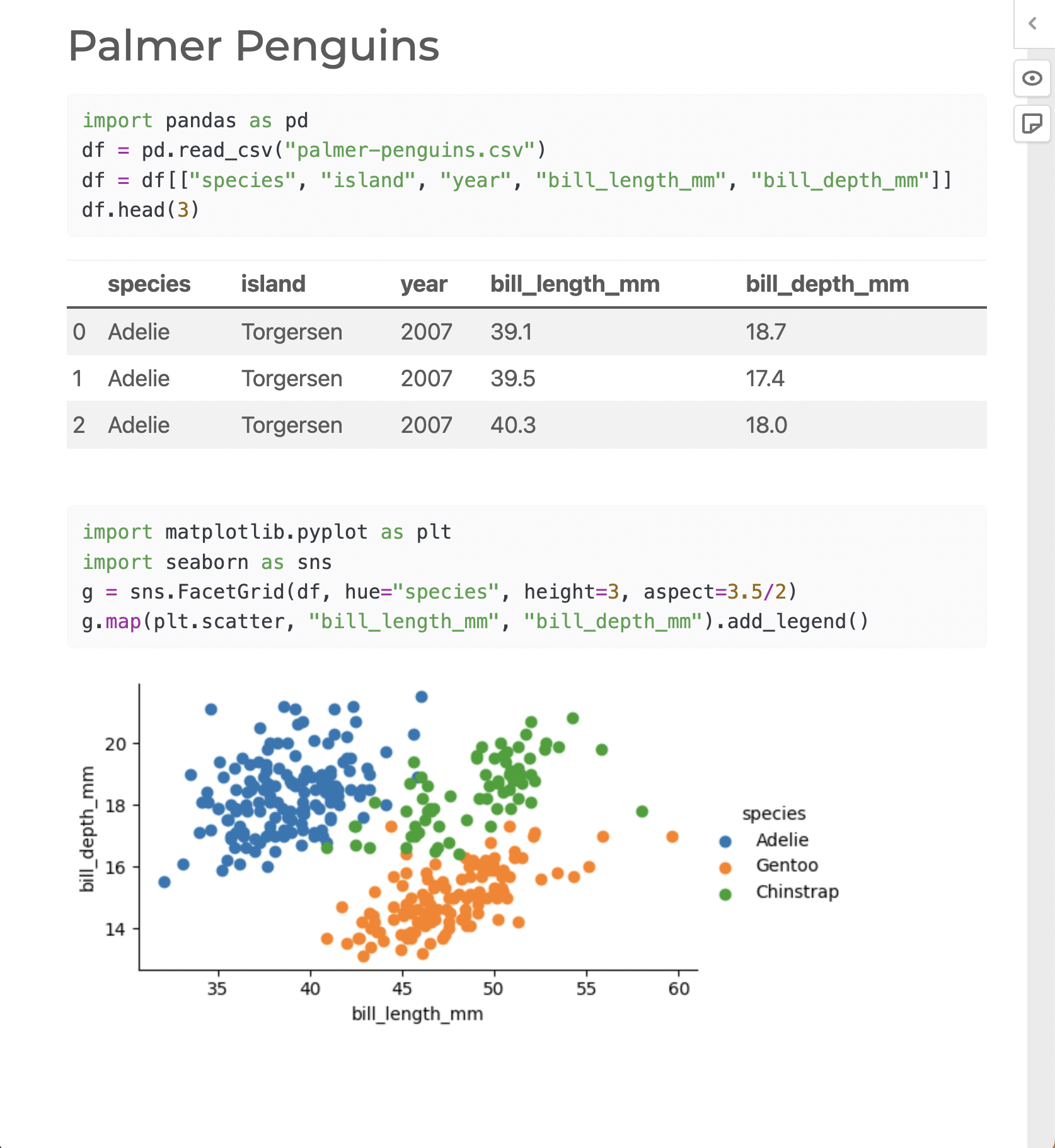
Render Notebook to HTML (document and cell level options)


Render Notebook to PDF — https://quarto.org/docs/output-formats/pdf-basics.html

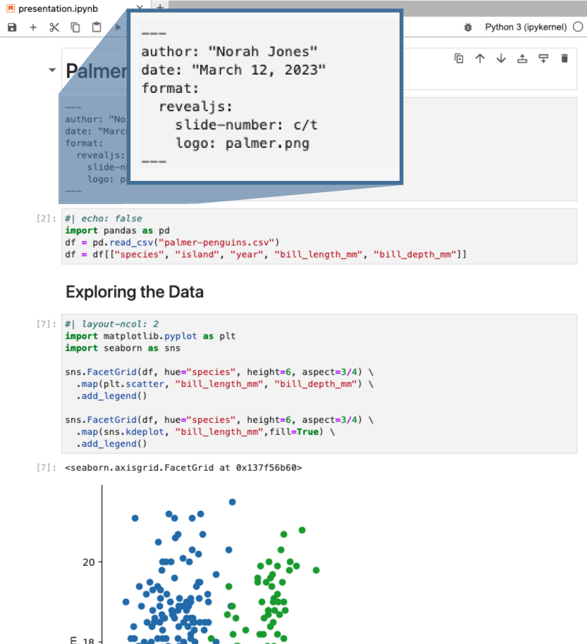
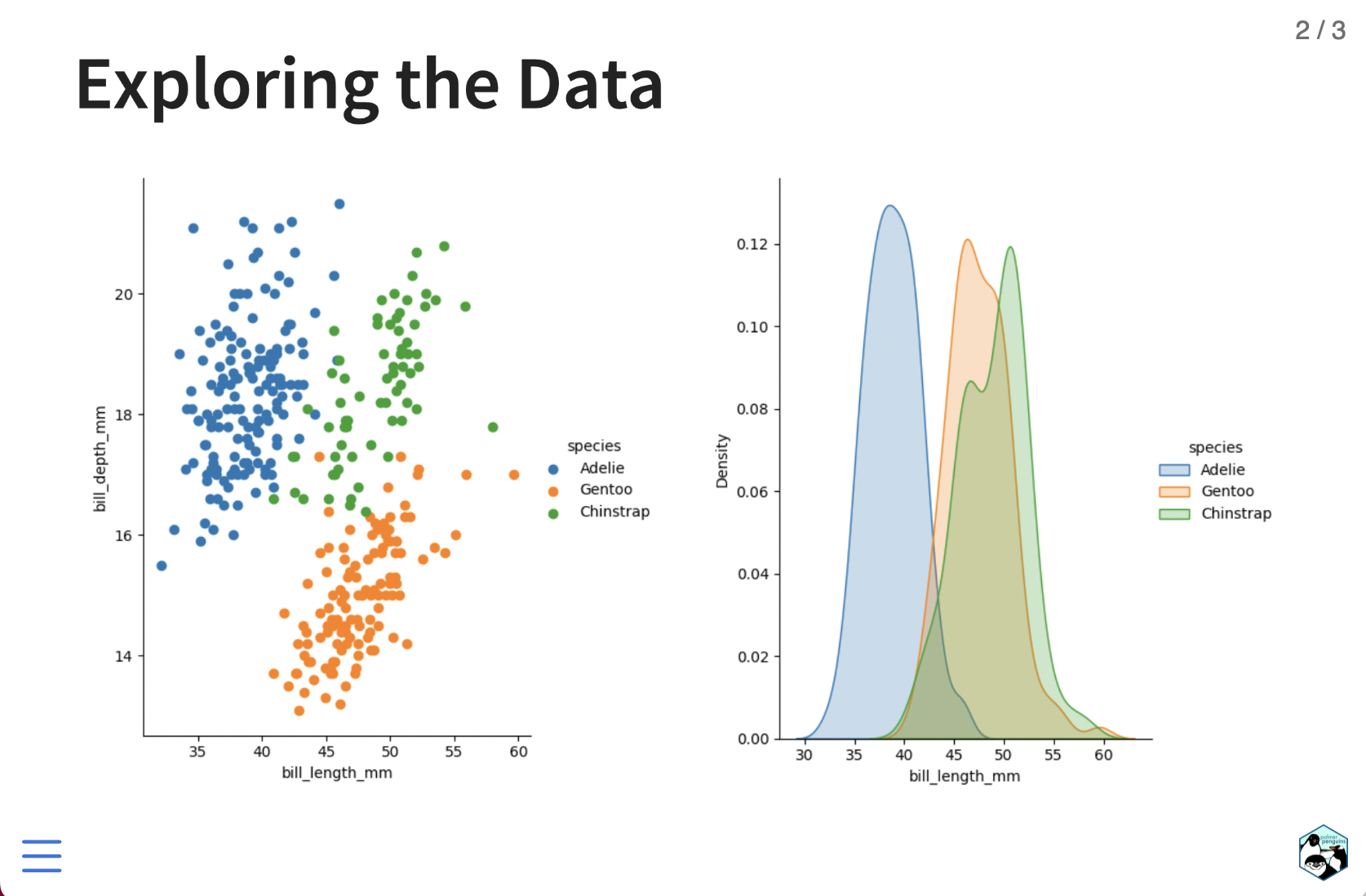
Render Notebook to Revealjs — https://quarto.org/docs/presentations/revealjs/
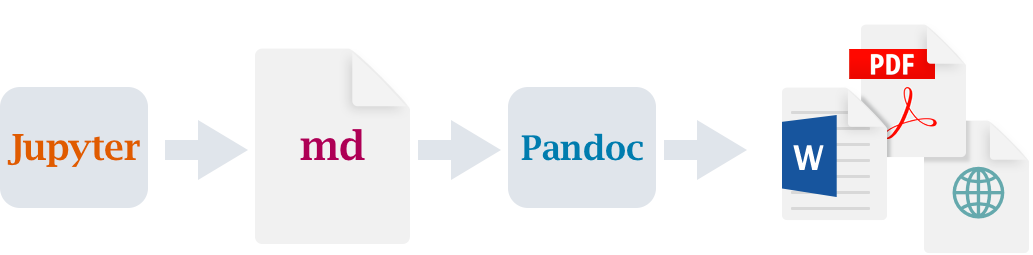
![]() Workflow
Workflow
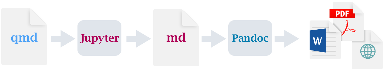
Rendering Pipeline
Notebook workflow (no execution occurs by default):
Plain text workflow (.qmd => .ipynb then execute cells):
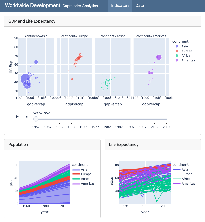
![]() Quarto Dashboards
Quarto Dashboards
A new output format for easily creating
dashboards from Jupyter Notebooks
Notebook ➝ Dashboard
Notebook ➝ Dashboard
:::
Notebook ➝ Dashboard
:::
Navigation Bar and Pages

---
title: "Palmer Penguins"
author: "Cobblepot Analytics"
format:
  dashboard:
    logo: images/penguins.png
    nav-buttons: [linkedin, twitter, github]
---

# Bills

# Flippers

# Data
Sidebars: Page Level
---
title: "Sidebar"
format: dashboard
---

# Page 1

## {.sidebar}

```{python}
```

## Column

```{python}
```

```{python}
```
Sidebars: Global
---
title: "Global Sidebar"
format: dashboard
---

# {.sidebar}

Sidebar content (e.g. inputs)

# Plot

```{python}
```

# Data

```{python}
```
Layout: Rows
---
title: "Focal (Top)"
format: dashboard
---

## Row {height=70%}

```{python}
```

## Row {height=30%}

```{python}
```

```{python}
```
Layout: Columns
---
title: "Focal (Top)"
format:
  dashboard:
    orientation: columns
---

## Column {width=60%}

```{python}
```

## Column {width=40%}

```{python}
```

```{python}
```
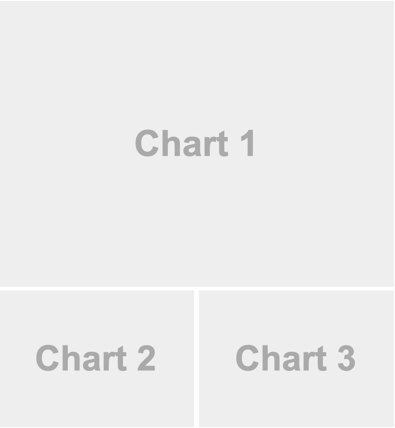
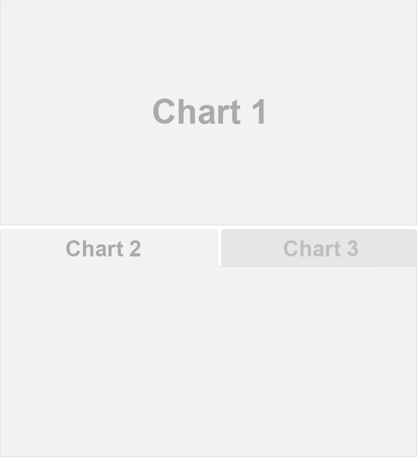
Tabsets
---
title: "Palmer Penguins"
format: dashboard
---
## Row
```{python}
```
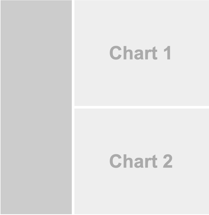
## Row {.tabset}
```{python}
#| title: Chart 2
```
```{python}
#| title: Chart 3
```
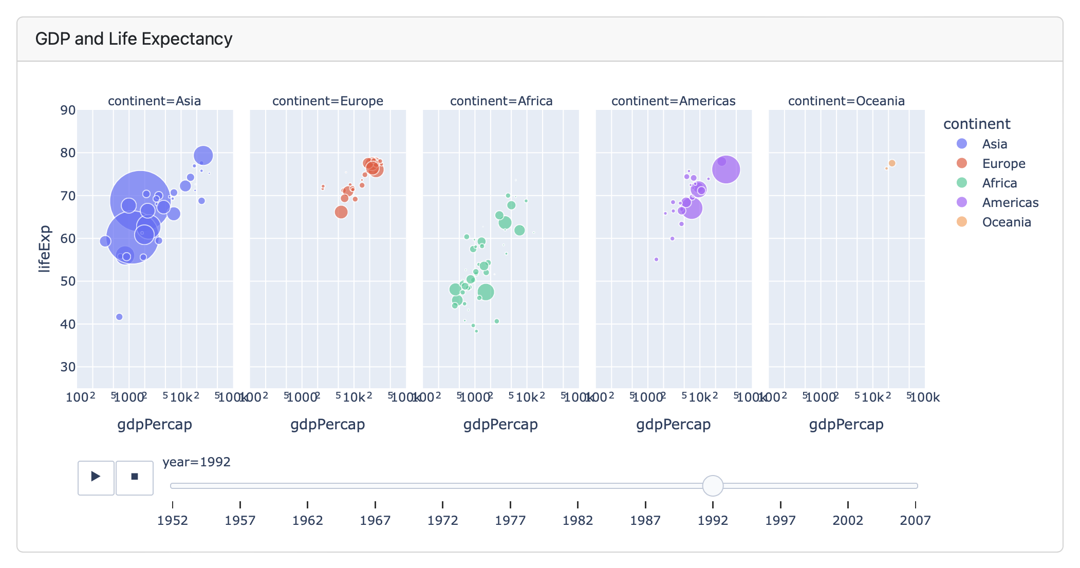
Plots
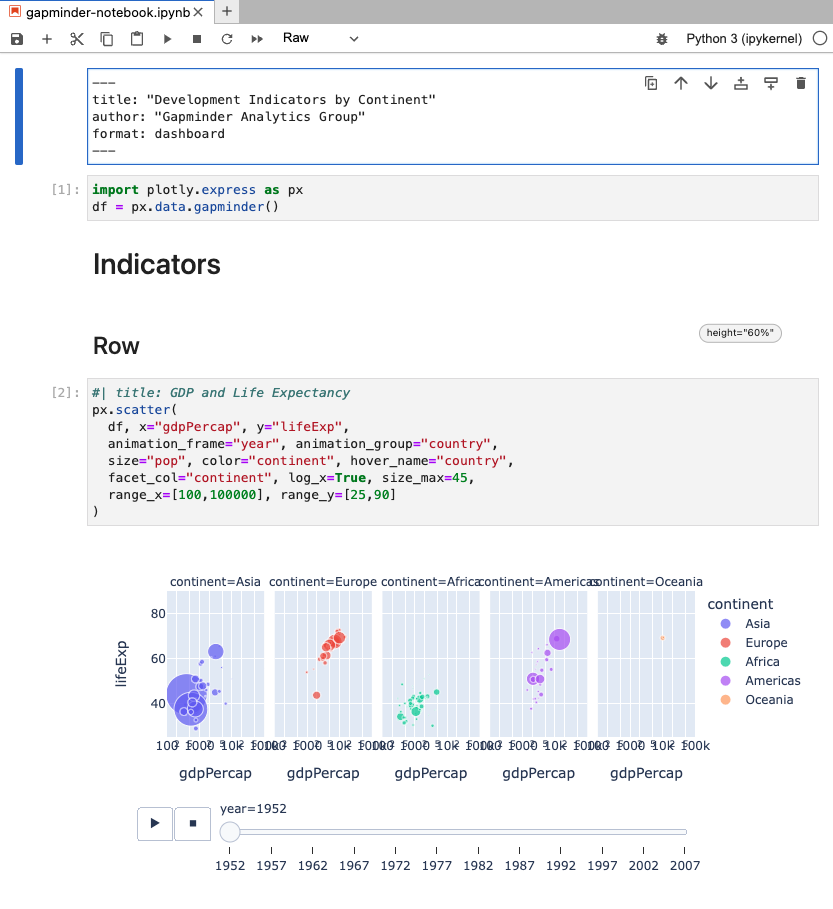
```{python}
#| title: GDP and Life Expectancy
import plotly.express as px
df = px.data.gapminder()
px.scatter(
  df, x="gdpPercap", y="lifeExp",
  animation_frame="year", animation_group="country",
  size="pop", color="continent", hover_name="country",
  facet_col="continent", log_x=True, size_max=45,
  range_x=[100,100000], range_y=[25,90]
)
```
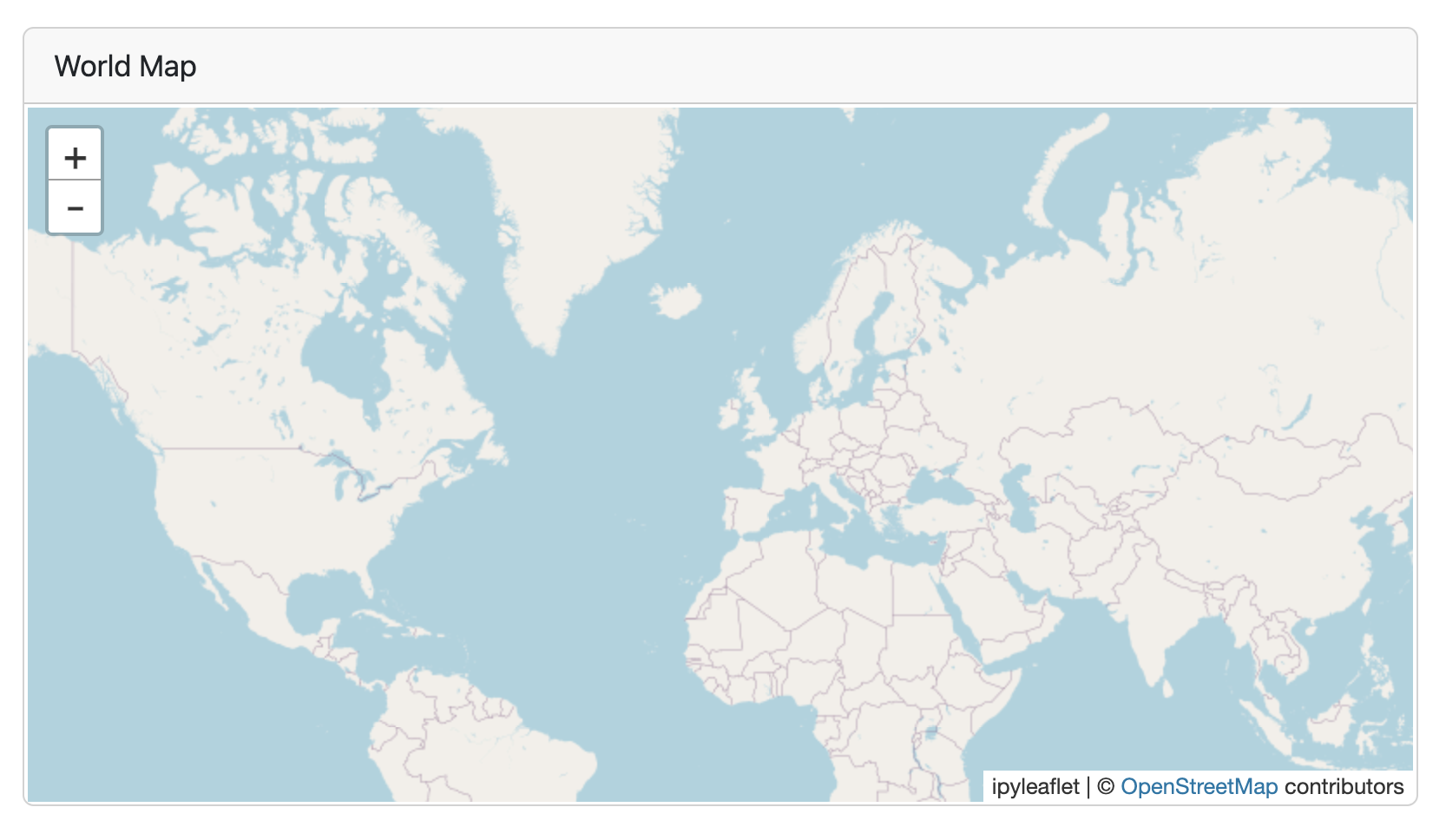
```{python}
#| title: "World Map"
#| padding: 0px
from ipyleaflet import Map, basemaps, basemap_to_tiles
Map(basemap=basemap_to_tiles(basemaps.OpenStreetMap.Mapnik),
    center=(48.204793, 350.121558), zoom=2)
```
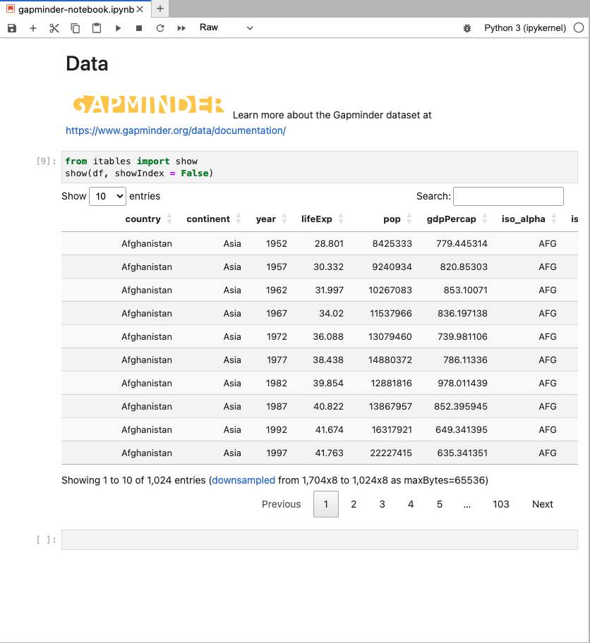
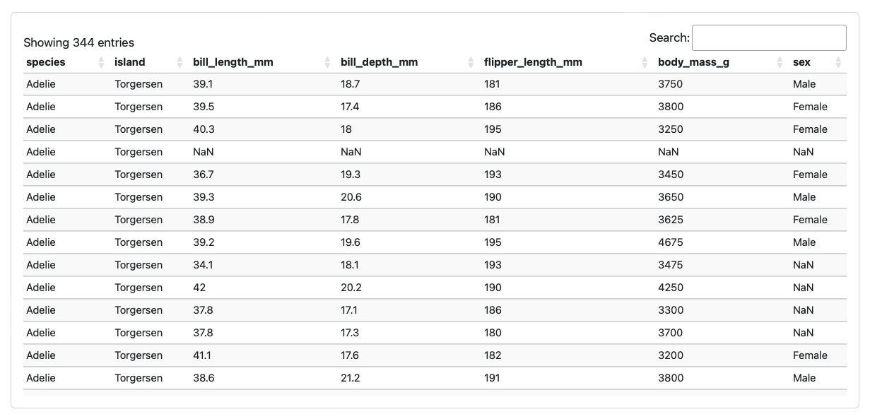
Tables
```{python}
from tabulate import tabulate
from IPython.display import Markdown
Markdown(tabulate(penguins, showindex=False)}
```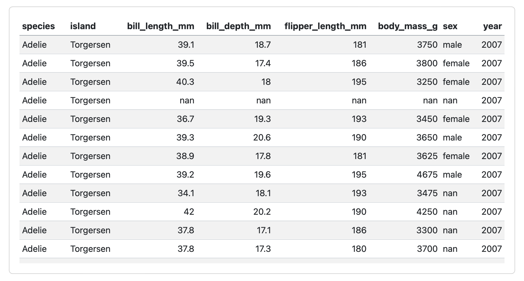
```{python}
from itables import show
show(penguins)
```
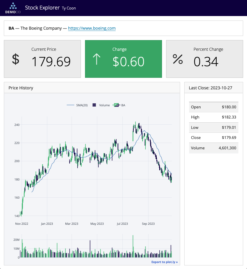
Value Boxes
## Row

```{python}
#| component: valuebox
#| title: "Current Price"
dict(icon = "currency-dollar",
     color = "secondary",
     value = get_price(data))
```

```{python}
#| component: valuebox
#| title: "Change"
change = get_change(data)
dict(value = change['amount'],
     icon = change['icon'],
     color = change['color'])
```
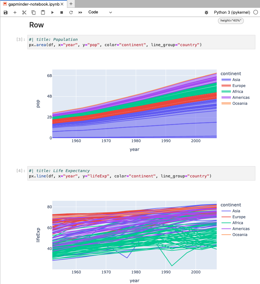
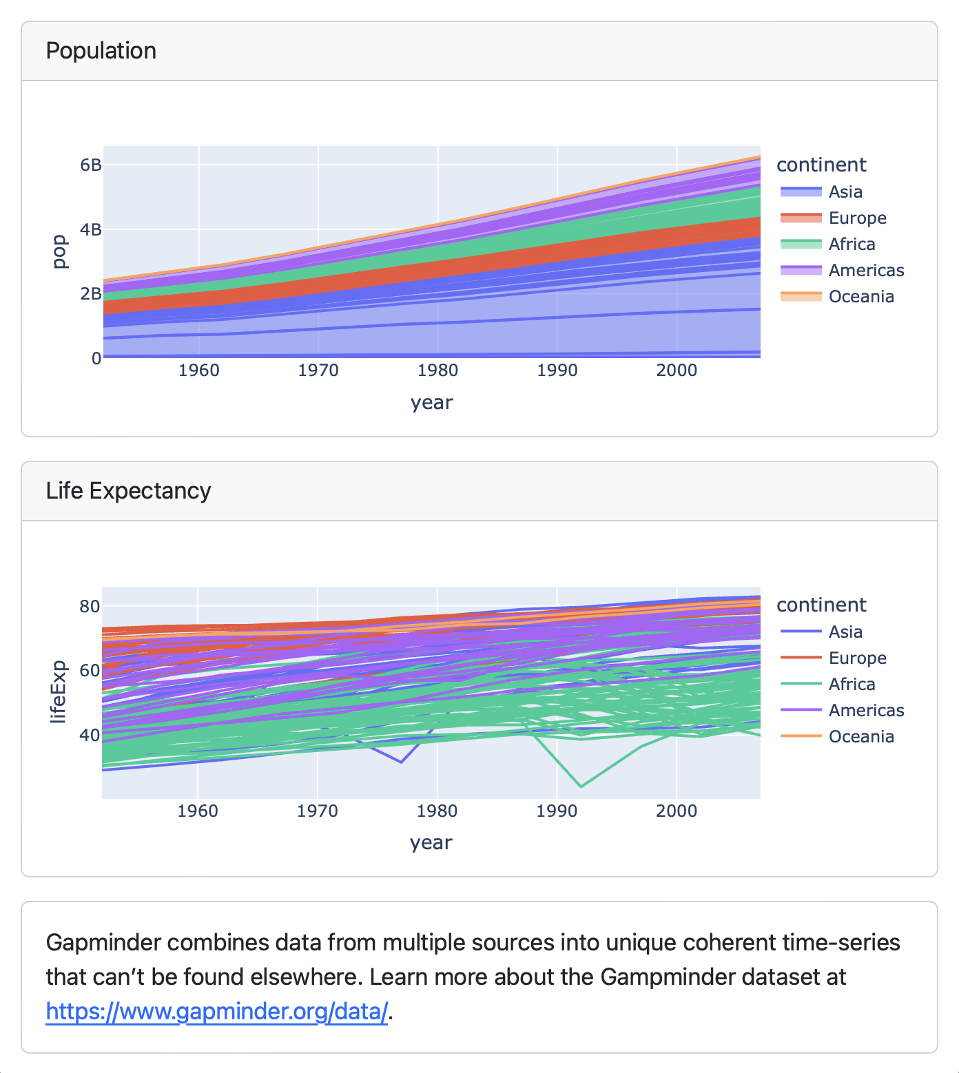
Text Content
## Column
```{python}
#| title: Population
px.area(df, x="year", y="pop",
color="continent",
line_group="country")
```
```{python}
#| title: Life Expectancy
px.line(df, x="year", y="lifeExp",
color="continent",
line_group="country")
```
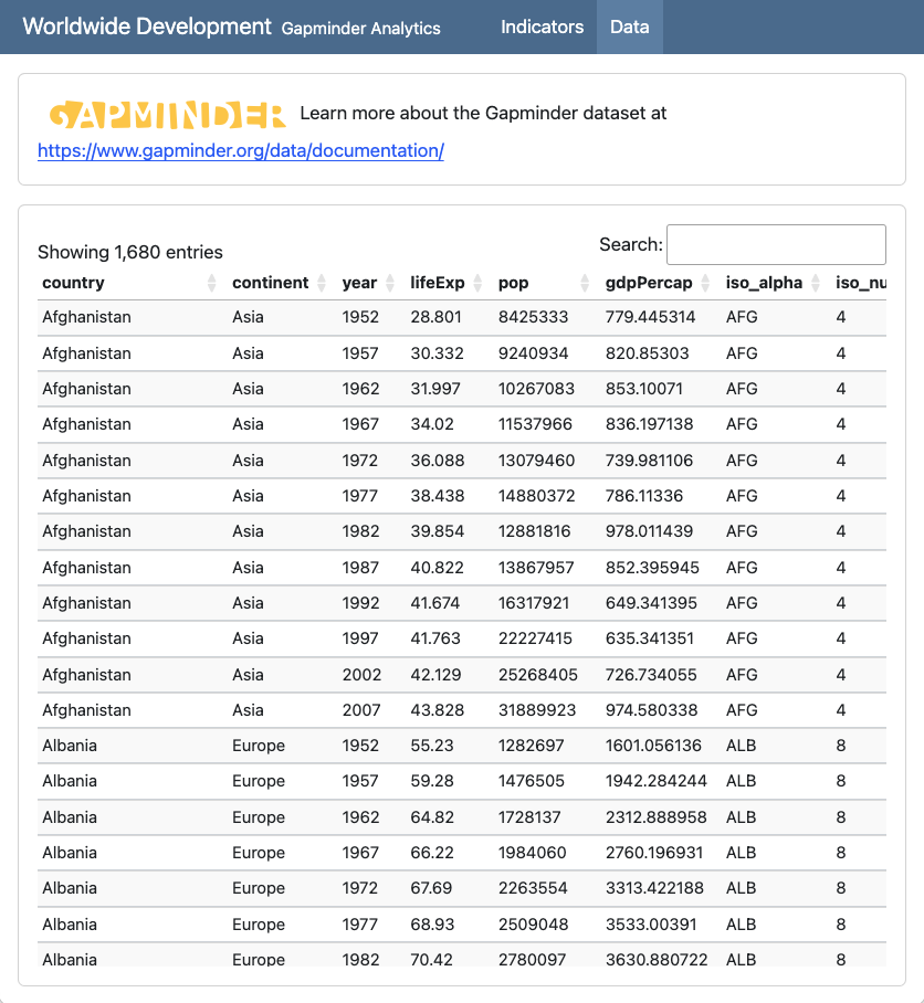
::: {.card}
Gapminder combines data from multiple sources
into unique coherent time-series that can’t be
found elsewhere. Learn more about the Gampminder
dataset at <https://www.gapminder.org/data/>.
:::
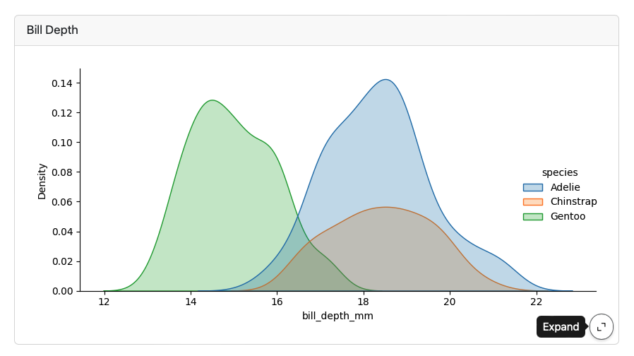
Expanding Cards
Cards provide an Expand button which appears at bottom right on hover:
Parameterized Dashboards

Add a parameters tag to the first cell (based on papermill) :
```{python}
#| tags: [parameters]
ticker = "BA"
```
Use the -P command line option to vary the parameter:
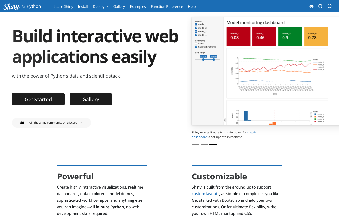
quarto render dashboard.qmd -P ticker:GOOGInteractive Dashboards
https://quarto.org/docs/dashboards/interactivity/shiny-python/
For interactive exploration, some dashboards can benefit from a live Python backend
To do this with Quarto Dashboards, add interactive Shiny components
Note that this requires a server for deployment
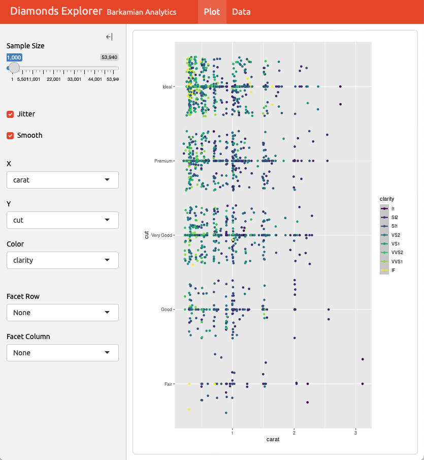
Hello, Shiny
---
title: "Penguin Bills"
format: dashboard
server: shiny
---

```{python}
import seaborn as sns
penguins = sns.load_dataset("penguins")
```

## {.sidebar}

```{python}
from shiny import render, ui
ui.input_select("x", "Variable:",
                choices=["bill_length_mm", "bill_depth_mm"])
ui.input_select("dist", "Distribution:", choices=["hist", "kde"])
ui.input_checkbox("rug", "Show rug marks", value = False)
```

## Column

```{python}
@render.plot
def displot():
    sns.displot(
        data=penguins, hue="species", multiple="stack",
        x=input.x(), rug=input.rug(),kind=input.dist())
```
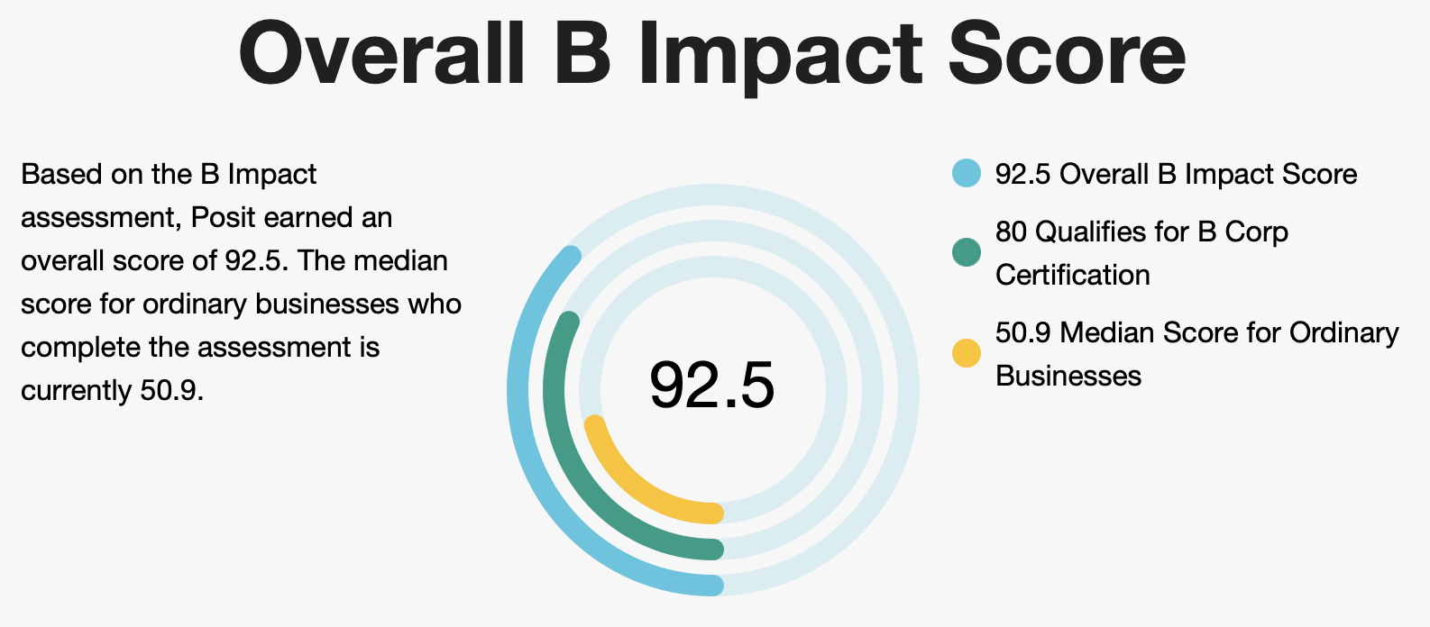
![]() Posit and Python
Posit and Python
Posit, PBC
Founded 14 years ago to create open source software for data science.
Posit is a Public Benefit Corporation with a mission to create open source software for data science, scientific research, and technical communication.
This is built into our charter, and our directors and officers have a fiduciary duty to pursue these public benefits along with balancing the needs of all our stakeholders.